TasteBuds final synopsis
During the course of creating the TasteBuds initiative with my classmates, I have learned a number of valuable things. I have always known that I would learn much, even through the most discouraging or frustrating times, but it is harder to really realize as much as try and force yourself to think that way while you’re going through it.
Working with a real-life client while in junior year of university has been priceless; I do not now nor have ever doubted that. I have always been told about “clients”, though, that scary thing out there that we would one day be forced to work one-on-one with and create something appealing for. It sounds prestigious, or at least I think I have always felt that it did. I think that in a way, it is. It is helpful to know how things will sometimes flow once we get out of school and are freelancing or looking for a job.
Working on the Identity Standards Guide, I was able to gain some more experience in InDesign, which I don’t feel like you can ever acquire enough of. I was also given the opportunity to learn about choosing colors for a brand or logo or initiative or anything. PMS and CMYK and HEX are all things that seem unclear to me still, even though I have spent a fairly large amount of time getting to know them. Our relationship is just still slightly shaky because I don’t know how different people or different parts of the project will react to them. I have, for the most part, discovered which facets of colors are used for which kinds of projects and materials, though.
Overall, it was most exciting to me to see the relationships being built throughout the class along the way of this semester. I feel that we really have built better relationships; I feel the need to check up on people once in awhile and make coffee cake in order to help the “family” along. Cheesy, but true; and definitely a positive thing, I think. We know how to work better not only with a large group of people, but with our classmates. I feel that that has been the best thing about this semester.
on Cindy Li and her presentations
On Thursday, April ninth, we had this totally non-typical day where we had activities – mostly outside of school – and got free food and were in good company. Leslie invited Cindy Li to come and speak to the juniors and seniors specifically; we all met at Greenspaces at 8 and had our first session with her. It was nice that designers outside of UTC decided to join in. We got Niedlov’s for breakfast, which all looked amazing; I’m definitely a muffin-top person, so I must admit that that’s all I ate, but it was delicious.
We went back to school and the juniors had the opportunity to sit with Cindy and Leslie and just ask questions and listen to Cindy’s answers. The part that fascinated me the most and which I had the most questions about was Cindy’s freelancing experiences up until now and how she feels about them for the future. It is terrifying to me but partly what I want to do at least at some small part in my future. I feel like it would be really good personal experience; being forced to create your own timely schedule, meetings with separate clients, and budgeting. All incredibly important things that I still have somehow not caught onto. For this reason, I fully understand that freelancing would probably not be the way for me to go just yet.
We were able to go to lunch at Easy bistro, which was a totally good experience. Their fairly new space is beautiful and wide open. The orchids at the bar made that side of the space look amazing and super chic, almost.
The whole day, the theme was social networking. This is a hard thing for me to really come to grips with, because I have been raised and have learned in past years through my own experiences that sometimes it is just best to stick to face-to-face relationships and leave out the no-strings-attached typing and texting. The whole thing smells somewhat dangerous to me, because our entire view of people has and will continue to change with the wave that social networking sites are making. I realize that these are important for employers to look at perspective employees, but what happened to interviewing and receiving recommendations? I understand why being interconnected is so important sometimes, but I just cannot understand why you would want to be connected and knowing of what your friends were doing at all times. I feel like eventually, masses of people will forget how to react and interact with the world on a true level.
This whole series of presentations was especially interesting to me, because the night before, I had read an article in GQ, where the editor quotes a British magazine called “Biologist”, and says that “An eye-opening new study reveals that if you spend a lot of time on Facebook and other social networking sites, chances are you’re alienated, lonely, and quite possibly demented.” After reading this article, I mentioned it to my dad and older brother, who are in different stages and walks of life than me, and they both kind agreed that they thought this way. My dad even threatens to fail his students if they do not cancel their twitter account by the end of his class.
So, this is where I come from with the entire idea of social networking. I understand why it has become addictive and therefore kind of important in our society. I understand why people use it and that it can be used in really productive ways; I cannot deny, though, that I am tentative to take a strong social networking persona at this time.
synopsis for completing the printers guide.
The printer guide project has been one in which I gained a lot of knowledge with issues that I have already had much experience with in the past. It has been interesting in this way, because I was half expecting it to be an easy throw-together type piece, which it definitely ended up not being. I am happy about this, though, because it has provided some challenges for me that I feel have improved my design in some way.
I love using InDesign, and have much preferred that over Illustrator for the last couple years, but during this project, I have come to appreciate Illustrator for easiness of some processes, such as manipulation to anything. I love the structure of InDesign, but sometimes it is a relief to just move into Illustrator and feel much more free.
My first layout for the guide was a total flop, which at first was disappointing because I really did research my idea for it; i looked through a series of constructivist-type design, which I have fallen slightly in love with over the past year or so. Although I thought it was working at first, I soon realized that it was not the way to go, and that I needed to figure something else out. I have also gained a massive interest in sewing in the last couple years, and although I do not really have any skills in that area yet, I decided to go with some kind of just creative theme. I found images online that seemed to work together well; strangely this included a hang sewing mixed with a diagram of ink rollers on a letterpress. I loved the shapes of the rollers from the side and incorporated that into my design.
My last design element that I decided to use was the word meaning “to make”, or “to do” in Czech, with stitches leading to it. Although I am anything but fluent in the language, I feel that it is closer to my heart language in some ways than english is. I did not use the word delat to draw other people closer to my guide, but simply used it for myself, to add something of my past into my work.
visit to allegra print & imaging
On Tuesday, April 14, our class was able to go to Allegra Print & Imaging.
This was an interesting field trip for me because I did a small bit of research on Allegra for our Printers Guides. I have included my final page layout for Allegra. At the beginning of this week, I was kind of terrified already knowing that there would be a huge lack of time in my life for the next 5 to 7 days; I was kind of stressed out about going to Allegra for a field trip instead of staying in class to work on upcoming projects, but I do not regret going, and it was probably in my top 10 of field trips I’ve ever gone on. That’s standing up against some pretty awesome places and tours, so I say it as a very positive thing.
Allegra is very welcoming from the first time you walk in the door; they have customer service right there waiting for you to help you. We started right away by going to the small but nice graphic design area of the company, moved onto the black and white small size printing area, and then went on to learn about the printing processes that go on in the next room down. It was completely fascinating to hear Jim talk about the printing presses and what can and must be done on them. It didn’t seem like he ever lacked any of the information that we were hungry for, but kept telling us everything he knows – in understandable terms – about printers and the printing process. We went into the warehouse part of the company then and saw their binding, folding, and glueing techniques.
Again, like RMG, it was good to see a local company doing so well for themselves.
RMG trip.
When we went to RMG, or National Print Group, I was excited to see what they were all about, but had no idea what to expect. They are huge. Although they have a graphic design department, they mainly just print massive things. They do work for some impressively large companies, such as Wal-Mart, Lowe’s, and Target. They have huge printing presses, HUGE ones. They have the largest printing press in the world. Mind-blowing. It was awesome to be able to see and kind of feel a part of. They also have rooms of guilitines and binding and folding machines. After being there and seeing everything and learning more about their company, I feel lucky to have been able to visit it and see everything that they are doing.
When we first went into RMG, we were warmly welcomed and then briefed on what we would soon be seeing throughout their company. They have a really large space of three, maybe four buildings. As we walked from one to the next, it was just almost alarming to be going into yet another building. Before entering the next building, I was never able to guess what else they could possibly be housing. We saw them printing certain things, mostly fairly small things, and were able to feel free to ask questions at any moment. It was very helpful and definitely a good experience to see all the good things happening at RMG, and to know that they are happening there as well as other places in our city.
finishing elements. 5.
Packaging –
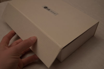
For my two packaging items, I used a gift card box that I received at Christmas. It has cheesy design on it, which I am not incredibly proud of, but I think that the product design of the case is helpful and reusable. It would be a useful container for business cards or something like that. The other package I found is from an LG chocolate phone. I like it and have kept it for awhile because I was pretty impressed that a box just from a phone had so much thought put into it; it’s a sturdy box made with textured paper outside and a flap over the front edge that is magnetic to the rest of the box.
Duotone –
I do not feel like I have a lot of resources for finding duotone photos within ads, but that’s probably a lie and a bad excuse. The only thing I found, though, was a couple photos of famous people next to each other in GQ. Amazing magazine, admittedly not so amazing photos or treatment.



finishing elements. 4.
Varnish –
The examples that I found for varnishing paper are a Casa Bugatti brochure/magazine, and a tag that includes extra buttons. The Casa Bugatti magazine is kind of a reverse spot varnish, covering almost the entire front cover, except for the sub-headline and the very outer edges. So the whole cover is shiny, and although this is an odd treatment, it strangely still makes the headline stand out. It also feels nice on the majority. The second example, the Tatuum tag that I found, is a tag on a string, as well as an envelope – the sport varnished part – as well as a clear tag specifying that it is duck down. The spot varnishing is the name of the company, and is in the same color of white as the background, but stands out because of the shininess.
Die-cut –
My die-cut examples are the Stefan Sagmeister collection “Things I Have Learned in My Life So Far”, and a weird St. Patty’s day card that my Aunt Jane send me. The Sagmeister collection is pretty recognizable now, but is still seen as being incredibly well done. The box/cover is die-cut to reveal holes in Sagmeister’s face, which can be refilled with different covers of the different books. The other example, the card, has a toilet on the front, and there is a hole in the toilet seat, and there is a leprechaun’s face and hat poking through. You can then open the card to reveal “Beware of Wee People”, and the leprechaun is dripping. It’s really quite strange, I kind of forgot about how weirded out I got when I received it.

weird die cut.

spot varnish

spot varnish. 2.
finishing elements. 3.
Thermography –
I can’t say that I really enjoy the thermography theme that many business cards seem to carry. I was relieved to find something slightly more legitimate than a cheap business card as one of my examples. On the other hand, one of my examples is an old auto center business card that I found from Ohio. The design on it isn’t actually terrible, they have wisely kept it fairly simple. And they have also used thermography on tiny little images, which I also kind of like more than on big titles, like the First Tennessee business cards. Ugly. My second example of thermography is my high school diploma. It actually looks pretty professional and formal, and although I can think of ways I’d rather see my diploma, I have hardly ever actually looked at it since I graduated. Enough money is spent on high school graduations anyway, so I think that if thermography was a slightly cheaper option for the school, they rocked it. It works – there is a thin plastic sheet covering the paper, and so through the plastic it looks shimmery as well as holds a texture. It is legible, and looks completely official.
Perforation/Scoring –
My scored example actually also includes a little embossing as well as some shiny red foil stamping, but it contains an obvious score. It looks as if it has actually be cut part way through, which is understandable to me, because if i paper is thick enough, sometimes it just makes sense and makes a process easier. It is a an old Valentines day card from my aunt. It’s scored in two places, the center fold, and another fold that flips around to form a kind of pocket on the inside of the card. The folds stay in place much better than if they were just bent and folded. I also have an example of perforation in good use. It is kind of a business card/advertisement for an amazing coffee shop in Prague, called Ebel. It looks like a regularly sized business card, but on the bottom, there is an attached 15% off coupon that is held on by perforation. It’s an ingenious idea. People may not ever remember to use the discount, but they will pick up the card because people are always looking for a bargain. And then whether they use the discount or not, they most likely have the advertisement laying around.


perforation.

scores.

finishing elements. 2.
Emboss/Deboss –
My examples of embossing are a cigarillo box and a match box. The reason that I kept these and picked them up for this project are because they’re overall nice designs, and the embossing just accentuates that. The cigarillo box is a Montecristo box, and the “MONTECRISTO” and the logo are box embossed. They have metallic accents, too, which makes the box seem more “royal”. The entire box is well-designed. The second example that I brought in is a Dunhill matchbox, which I picked up in Germany just because I liked the design. It has a slide out for the matches, the scratchy part on just one side, and a little lift-up flap that has information inside. It has a simple design on the front, and it is embossed.
Foil Stamp –
Once I started looking, I actually found foil stamping to be fairly common on a few things – foreign currency and different types of tickets. So for my foil stamp examples, I have found a 5 pound note, as well as an older public transportation ticket from Prague. The 5 pound note uses foil stamping almost the same way that watermarks are used on American currency (even though British money also has a watermark in the center). It has a hologram in it, sometimes seeming like a “5”, and when moving it, seeming like a possible queen with sun rays shooting from behind her. The metro ticket from Prague uses the foil stamp for legitimacy as well, I think. It is just an eight-sided star in the upper right-hand corner. It is also a hologram, seeming empty at one point, and then “Praha” appears, and when turned in yet another direction, containing the Prague public transport logo.

passport photo folder.


foil stamp on prague metro pass.

finishing elements.
In Process and Materials, we have been visiting different printers around town, and have researched a short list of finishing elements that can be used in order to differentiate design from the majority. These are my findings.
Binding –
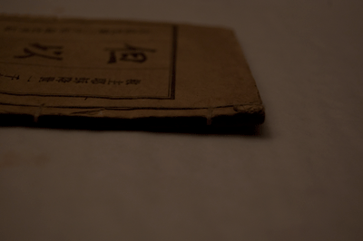
The two examples of binding techniques that I have chosen are fairly normal, but work well and look good. My first example is a paper book that someone brought me from China, with a typical looking Asian binding. It is completely visible, and can be seen on the front and back covers. It’s beautiful, and although it would not work for all types of books, it works well for this small type. My other example is a book that I made for a class two years ago, when I was attending university in London. I think that it is an example of something perfect bound (?), which is just a typical type of binding for novels and longer books. I’m glad that I learned how to create this technique, because I hope to use it quite a bit more in the future.
Fold –
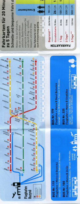
It is pretty typical for me to use this small map as one of my fold examples at this point, since everyone is probably tired of seeing it, but I still am consistently impressed with it when I see it. It is a creative way of folding, and fits a lot of information in a relatively small space. We have talked about how innovative it is, and I still have not really seen anything like it. My second example of a creative fold is a small book that I acquired at some point while travelling through a London airport. I love that towards the end of the booklet, the pages transform into a fold-out map.
prague guide.

perfect bound.

interesting coil.

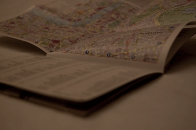
booklet and map.
